Monday, February 22, 2016
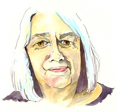
Marilyn
Wednesday, July 14, 2010
Gillian Mowbray for JKPP

GillianMowbray-JKPP
Originally uploaded by Anita Davies
Noodlers Bullet Proof Black in Lamy Safari pen and acrylic inks in Moleskine Folio
Ref:
www.flickr.com/photos/10071683@N04/4724028754/
Anne Watkins for JKPP

AnneWatkins-JKPP
Originally uploaded by Anita Davies
Acrylic Ink and Markers on Arches 140lb HP paper
Ref:
http://www.flickr.com/photos/annewatkins/4555316198/in/set-72157623618439626/
Sunday, March 28, 2010
3 Minute Mill
I recently visited Denver Mill and, after indulging in a slice of their delicious madeira cake and making a quick sketch in the cafe garden, I pulled onto the side of the road to make this...an experiment...Copic markers and acrylic ink on canvas board.
I was wondering if it would be possible to sketch on canvas and ....it is...However, when I applied a coat of acrylic varnish, the markers livened up and smudged all over the place.
Oh well, worth a shot!
Luckily I spent only 3 minutes on this sketch and managed to photograph it before I applied the varnish, so all is not lost!
Tuesday, March 23, 2010
Forgotten Fast Floral
Friday, March 19, 2010
Sketching On Canvas
My Parents House - Acrylic ink on canvas - Plein Air
...With a dip pen and acrylic inks, I then used a brush to add tonal washes.
The ink is black and white so I have no idea why the hedge is showing as blue?
Thursday, February 04, 2010
The Wash
'The Wash' - Acrylic Ink and Atelier Acrylic Interactives on canvas
The second painting I made during Joannies stay using the interactive paints, making something of another prepped canvas in the studio and discovering how the media handled.
Again, this was painted in very little time with a one inch, flat brush...This time from imagination/memory.
Fun!
Wednesday, February 03, 2010
New Toy
Painted from sketchbook reference
Acrylic ink and Atelier Interactives on canvas board
Joannie arrived last Thursday to stay with me for a few days. She brought along the order of Atelier interactice acrylics I had purchased from the SAA , complete with free spray bottle and instructional DVD by Mitch Waite...Our new toys for some studio fun during her stay!
After watching a couple of the half hour sessions on the DVD, Joan and I could wait no longer and dashed into the studio to open our new paints.
I started by pouring some acrylic inks onto a canvas board that's been hanging around the studio acting as a sampler for my students, it had various textures and pint blobs all over it as a result so the inks just brightened it up a little. I then worked very quickly with a one inch brush, blocking in my composition boldly using shape rather than a drawn sketch.
I really enjoy this way of applying paint.
The interactives were wonderful to work with, livening up with a little water spritz allowed me to work the whole canvas at once without the risk of areas drying out. They allow a much more unified result with a lot less work and paint.
The resulting painting took very little time, approx 30 mins...loose and spontaneous...Just what I had been after, I decided immediately that I liked these paints very much. I could have spent more time but I reached a stage here where the result excited me so much that I didn't want to lose it. I haven't painted much in the last two and a half years, what I have painted has been mostly commissioned, but I have dreamed of painting...thought of painting...painted in my mind...painted in my sleep... My sketchbooks have achieved a new confidence in my art and a longing for atmosphere and expression. They have also given me a new insight into landscapes, a subject that had never interested me in painting before.
My new paints unlocked me and in the three days Joan and I painted I created no less than 5 pieces of work, getting familiar with the medium and working boldly, with passion...enjoying every single moment.
This journey is going to be so much fun!
Joannie in my studio - Jan 2010
Sunday, January 31, 2010
Iris
Anita Davies 2010
This canvas has been sitting around the studio for a couple of years now, with a prepped background using gesso to texture and acrylic ink to tone, it sat idle waiting for me to be inspired enough to take it further.
A few days ago I decided on iris for a subject and set about it with gesso again, mapping out with a brush, the forms I wanted to re-paint to give a fresh base for the new ink applications to shine on.
This is the result.
Any ideas on a title for the piece?
Tuesday, January 26, 2010
Blue Clematis
Breaking Free - Acrylic ink on watercolour paper
This is another of the pieces I painted at Joannie's during one of our play sessions, this time we had a subject in mind when we started throwing ink around.
It defines the limitations we put on ourselves, through the barriers we build, the start of new beginnings and the enlightenment they can bring.
Thursday, January 21, 2010
Playing With Yupo and Ink
These are the two pieces I created while 'playing' at Joannies last week, a warm up exercise before moving onto more developed pieces enabling the child within to escape and keep things loose.
The top piece was created by sloshing inks onto yupo before applying another sheet of yupo over the top and pressing down to produce a print. The suction between the two sheets left very detailed patterns as I peeled the top sheet back, I then went in with more ink once dry to develop some of the shapes.
The poor girl with the deformed bottom in the second piece was created in the same way but with more development in the later stage.
I found this process very freeing, it was fun developing something from a few shapes with no plan of the final outcome.
Saturday, March 14, 2009
Waiting For Harry

A quick sketch while waiting for Harry to come out of school. I added the watercolour sky on location and the acrylic ink splashes back at home in the studio.
Saturday, August 23, 2008
Inks and a Bin Liner

Played around with ink and a plastic bag.
I started with the splashes of acrylic ink first thing in the morning.
A couple of hours later I sketched the figure with my Lamy Safari fountain pen filled with red-black Noodler's ink. Then I used a water brush to blend some of my loose hatching for tone.
Later that night I poured neat ink into a puddle on the page and covered it with a crushed plastic bin liner before closing the book, weighting it down and heading off to bed.
This is what I woke to in the morning when I peeled off the bag.
Fun!
Tuesday, April 15, 2008
New Project Plan For Summer

So, I've had this idea churning away in my mind for a while now, it's so easy to come up with ideas and plans in your mind but never actually see them prosper so I thought that if I put it on paper it would make it real and get me motivated to act on it.
Last Summer I visited various counties, many 'local' National Trust homes, stayed at hotels, travelled miles and paid entrance fees and memberships. On my return from every visit, I would drive through my neighbouring villages and soak in their beauty briefly before finally pulling into my drove.
It gradually began to occur to me, that we often fail to notice or appreciate what is right in front of us!
This Summer I plan to open my eyes to my local surroundings.
Not in just any old form though. I won't just be hand picking the huge, decadent houses and the historical landmarks...Oh no!...Although they may feature here and there they will not be my focus.
I will be sketching 'normality', peoples homes, old, new, big, small, fancy gardens and skips. All the ingredients that come together to generate the 'flavour' of the village.
The title 'CLOSE TO HOME' emphasises the fact that these are peoples homes as well as highlighting where I have worked all Summer.
I thought it may be interesting to show my thought process behind this project. I am thorough when I consider anything, I imagine the worst, the best, the angles and the pitfalls.
Here they are:
RESEARCH & THOUGHT PROCESS
Art is very difficult to sell in my area. There is little done in the villages and the Town to promote the arts and therefore most people tend to pick up a mass produced print or a shabby piece from a charity shop...It's a fact! They want affordability at their rate and this causes problems when you work very hard on a piece and have to consider selling well below it's worth.
Therefore, it will come as no surprise to learn there are no local galleries. These are situated in more tourist areas such as Ely and Cambridge itself. Local exhibitions seldom create a huge number of visitors and most are there to browse.
Prints that do seem to sell are location landscapes and landmarks.
MY BELIEFS
I seriously believe that art should be affordable to all. I love what I do and no amount of money will detour me, so I treat it simply as the icing on the cake with the realisation that someone wants to wake up to something I created in their home being far more thrilling to me than a cheque.
MY PLAN
* Start in May
* Create sketches, in pen and watercolour, to keep them atmospheric, full of character and affordable!
* Concentrate on my three neighbouring villages: Doddington, Benwick, Wimblington.
* Produce an average of 3 sketches per week
* Look into self-publishing to create a picture book of the project as a whole
* Produce greeting cards with images
* Mount originals and have them shrink wrapped for protection.
* Arrange exhibitions in the 3 village halls - A mini tour, with the possibility of a final exhibition in March (Our local town)
* Exhibitions to take place near Christmas, November time?
CONCLUSION
By creating plein air sketches that are unframed, I can keep the costs affordable to everyone.
By publishing I increase sales chances both locally and over the internet.
By creating greeting cards, I give the opportunity for choice and enable clients to purchase numerous pieces to perhaps share with friends and family outside the villages.
By focusing on 'normal' homes I create a curiosity, a personal reason to visit the exhibitions...Planting the idea that 'your very own home may be part of this exhibition'
By exhibiting near Christmas I raise the chance of sales as gifts.
WORSE CASE SENARIO
No one visits the exhibitions
No one purchases a thing
Ok, it's not ideal BUT...
Self publishing means that I haven't paid a penny until I make a sale, all I need is to purchase A BOOK for my own bookshelf and show it at the exhibitions, taking orders...Paid in advance.
No loss!
I have a heap of sketches on paper sheets that I would have sketched anyway. I sketch daily, I like it!...No...I love it!
No loss!
I send the cards I ordered to family members on various occasions throughout the year until they are gone.
No loss!
So...There's my plan, my best shot....May it is then!
Thursday, March 13, 2008
Sporting Art

I painted this in my Altered baby Book this evening using sepia pigment liner and gouache. Item #160 on the Weekly EDM Challenge List is to ' Draw A Trophy', it belongs to my favourite sportsman of all...My eldest Son Jake.

Read more about my Altered baby Book HERE
I also uploaded these two Spring designs into my card shop at GCU today for Easter, I'd totally forgotten that I painted the Daffodils last year and thought they'd be perfect for the occasion.

My Shop at Greeting Card Universe
You may remember me mentioning the BBC1 programme 'Sportrait' showing the process a group of artists take to complete a commissioned portrait of a sports star to be auctioned for sports relief later this year.
Well...
This is Jack Vettriano's -

It was fabulous to watch all of the artists that took part but, for me, Jack stood out not only for his obvious painting talent but because he was so...well....human! Looking at his work you could never imagine that he would have the same fears, doubts and nerves we all face when approaching a commissioned piece, in fact, he was much more nervous than I have ever been but then, I haven't been commissioned to paint Royalty......Yet!
Sunday, February 10, 2008
Next...

Harry - 15 mins - sepia ink
This is the final page in my 21cm x 15cm Canson HP watercolour sketchbook.
I have enjoyed this book so much that I recently ordered another, along with a smaller 15cm x 10.5cm one for my handbag. The 230gsm paper reacts well to watercolour washes, coloured pencil and ink and it's smooth surface makes writing a few notes a pleasure.
I've decided to put the new Canson aside for now and use the Saunders Waterford book I have on my bookshelf next. It is the same size (21x15cm) but is made of thicker 300gsm HP watercolour paper. It has 36 pages, comes in 3 sizes (A5, A4, A3), 3 grades of paper (HP, NOT, Rough) and starts at £13.95.
I'll be starting my new SW journal today!
Wednesday, October 10, 2007
Life Class - Week 8
Gouache on Bockingford watercolour block - 25 min pose
Week 8, the second session of this batch of life classes. I guess I should call them 'sessions' as they are model only with no tuition but class just rolls off the tongue so much easier doesn't it?
Anyway, this week I took my brand new gouache set along, it travelled well and behaved wonderfully. I experimented with it on white watercolour paper (above) and was very happy with the results.

Ink in W&N heavyweight sketchbook - 3 min poses
There were two back view poses this week. I love back view poses, they look so elegant and sensual with all those wonderful curves, I think because, even when naked, they leave so much to the imagination and silently encourage an amount of respect and innocence.

Ink and water brush in W&N heavyweight sketchbook - 10 min pose
I also experimented with the gouache on a coloured background on watercolour paper I created by mixing two acrylic inks liberally onto the surface and then covering with a scrunched bin liner. Luckily it dried in time for the final pose, a tricky little number with some challenging foreshortening in the leg area. I spent most of the 25 mins positioning the figure on the page and then concentrating on those legs. We are going to have this same pose for 25 mins each week at the end of our sessions to enable us to build a work through. I wish I had remembered my canvas for this but the acrylic background presented new challenges in itself and allowed me to get more acquainted with my new medium.
Thursday, September 20, 2007
'Zephyr'
The Task:
Produce a series of ten works, each 8x10", on canvas to be hung together in two groups of five either side of a staircase.
I originally began with this design. The background colour is a mix of French Grey Blue and an exact match of the lower half of the hallway wall (below dado). I applied these randomly with a knife. The hall carpet is also blue and the top of the wall is white, so I brought the orange in as an accent colour.
I soon realised that walking alongside ten of these, both sides of you could feel a little 'busy'.
I wanted to add some interest to the room, while keeping the light, airy, calm feel.
Starting again, I applied the background, this time with a softer texture that resembles sky. Keeping things soft I added the simple daisies in a pale French grey blue. The daisy centres provide the accent colour I was originally after without being too loud and were applied using a pipette and acrylic ink, as were the stems. I decided to leave the stems unfinished to give the daisies a 'floating' appearance which is where the title for this series was born.
ZEPHYR - A soft, gentle breeze.
I used yellow ink to highlight the daisy centres and white ink to highlight the daisy petals. I then drained the pipettes of all three inks (Yellow, orange & white) and squeezed them over the top of all five paintings to give a splattered 'windswept' effect.
8 x 10" Acrylic Paints & Inks on Canvas - (Taken without flash)
I am much happier with this design, so simple and yet hung together the five are quite effective.